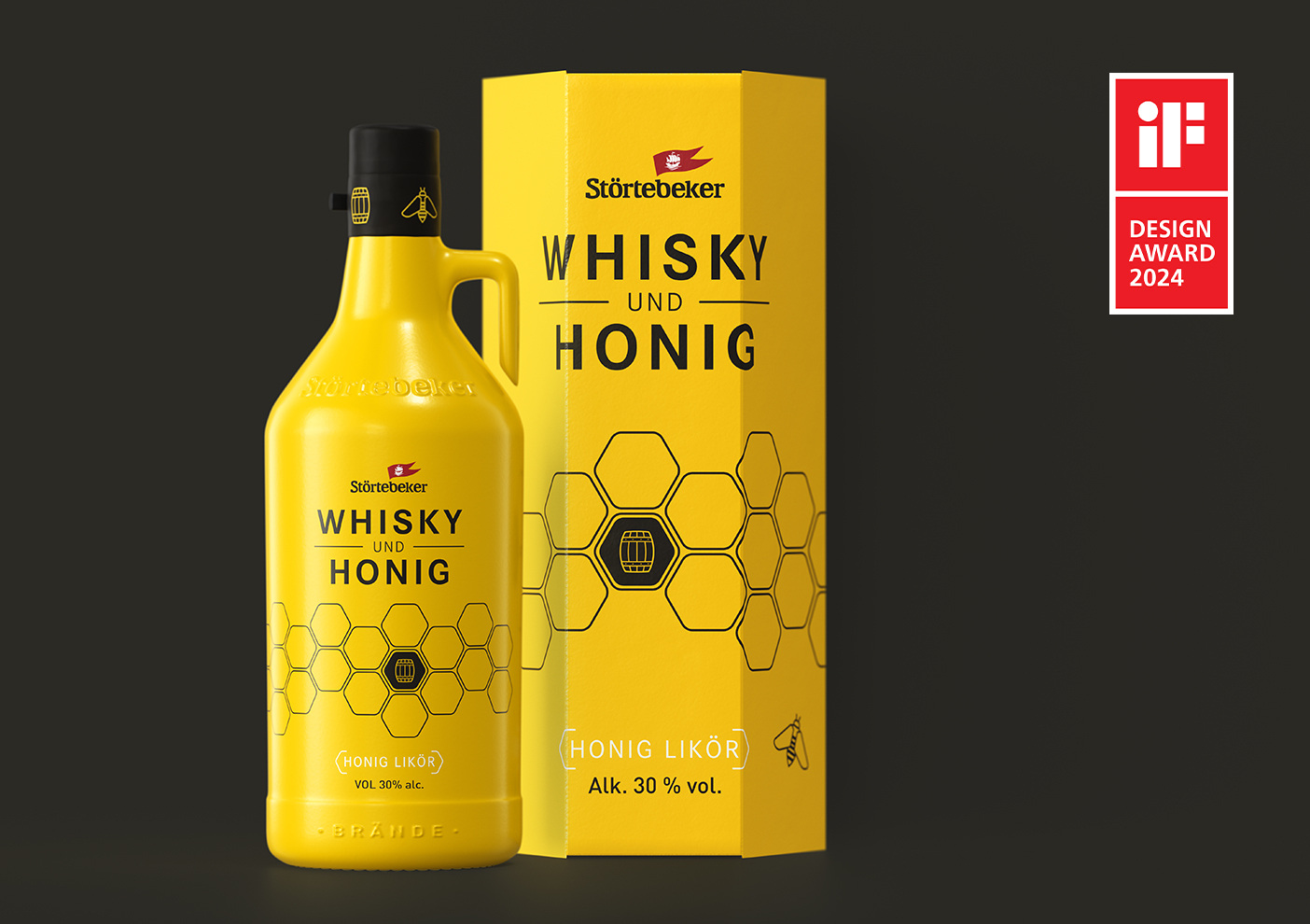
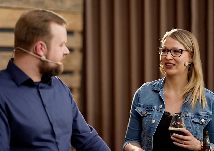
News

Mit dem Sortenkompass auf Kurs zum passenden Störtebeker 29. November 2023 ‐ UI/UX-Design

Mit dem „Störtebeker Sortenkompass“ begeben sich Bierliebhaber*innen auf eine Reise in die Welt der Bieraromen – und zu ihrer liebsten Geschmacksrichtung. Perfekt für alle, die sich zwischen Ale, Porter, Lager und Pils schon mal verirren. Unter dem Motto „Finde dein Störtebeker“ hat wertmarke einen bunten Kompass entwickelt, in dem jede Farbe ein Störtebeker-Bier widerspiegelt. Entweder über Multiple-Choice-Fragen oder intuitiv können sich Kund*innen im Störtebeker Brauereimarkt mit der Navigierungshilfe über ein iPad vor Ort oder ihr eigenes Smartphone direkt zu ihrem (neuen) Lieblingsbier führen lassen. Noch befindet sich der Kompass in der Beta-Phase, nach Abschluss der Testzeit soll er in die gesamte Marken-Kommunikation integriert werden. Damit zukünftig kein Störtebeker-Fan mehr auf dem Trockenen sitzt.

Bio-Biergenuss aus dem hohen Norden 01. November 2023 ‐ Packaging

Ein erfrischendes Prost mit der grünen Flasche – dem neuen Stralsunder BIO-PILS. Mit diesem Bier lässt sich nicht nur der Moment mit Freund*innen einfangen, sondern auch die Kraft der Natur, denn die ist in den Zutaten enthalten. Höchste Qualität sowie Nachhaltigkeit stehen hier an erster Stelle. Genau das beschreibt der Name „BIO-PILS“ klar und ohne Umwege. Ebenso reduziert und bewusst plakativ hat wertmarke den Look der neuen Flaschen designt.

Ein Corporate Design, das den Fokus aufs Wesentliche lenkt 18. October 2023 ‐ Corporate Design

In Privatleben, Beruf sowie Gesundheit das volle Potenzial entwickeln – dabei hilft die Life, Business und Health Coachin Dr. Kirsten Schlömer ihren Klient*innen. Wertmarke hat ihr dafür ein gelungenes Corporate Design kreiert: Die Icons für die drei Säulen ihrer Arbeit sind bewusst klar und reduziert gehalten, die Farbe Petrol lenkt das Auge auf den empathischen Gesamtauftritt der Marke. Denn die beruhigende Wirkung der Kolorierung spiegelt ebenso die Klarheit und Leichtigkeit des Coachings wider wie auch das Logo und der Logoschriftzug.

Meilenstein im Störtebeker Whisky Crowdfunding 04. October 2023 ‐ Corporate Design

100.000 € in nur zwei Wochen sammeln – das war das Ziel der ersten Stufe der wertmarke-Kommunikationsstrategie für die Crowdfunding-Kampagne von Störtebeker Whisky. Über personalisierte Mailings, Website, Social Media und an den Standorten wurde die bestehende Störtebeker Whisky-Community auf die Kampagne aufmerksam gemacht – und hat mit 260.000 € die benötigte Summe mehr als verdoppelt. Über einen Film und ein Störtebeker-Markenportrait wurden in der zweiten Stufe Investor*innen auf der Plattform www.invesdor.de angesprochen, und hier war das Ergebnis noch beeindruckender: Nach nur vier Stunden war die Zielsumme von 500.000 € erreicht.

Hi, Honey: der neue Whisky-Likör von Störtebeker 19. July 2023 ‐ Packaging

Neben den klassischen Whiskysorten lockt nun auch eine süße Likör-Variante ‒ nicht zu übersehen durch ihre leuchtend-gelbe Verpackung im Sechskant-Look. Die Natur stand Pate, als wertmarke das Packaging in Wabenform entwickelte, das den Growler zuverlässig schützt. Geringes Gewicht und höchste Stabilität zeichnen die Kartonage aus, die sich angelehnt an die Wabenbauten der Bienen spielend leicht stapeln lässt. Der Growler selbst steht der Verpackung in seiner Signalwirkung in nichts nach. Auch er sticht durch die gelbe Farbe sofort ins Auge und vermittelt dank einer umlaufenden Wabenstruktur und einer stilisierten Biene unmissverständlich, welch aromatische Köstlichkeit auf den Genießer wartet.

Ein Designerkleid für die Kleinsten 03. May 2023 ‐ Corporate Design

Aller guten Dinge sind drei: Das gilt ganz besonders für die Brennmeister-Edition von Störtebeker. In einem quadratischen Karton warten drei Mini-Growler darauf, entdeckt und geöffnet zu werden. Die Form der 0,2-Liter-Henkel-Flaschen gleicht der des großen Bruders bis ins Detail. Zu den Sorten Klassik und Limited gesellt sich in der Brennmeister-Edition ein Whisky-Neuling, für den wertmarke eine eigene Verpackung kreierte. Analog zum großen K und dem stilisierten Fass der beiden Whisky-Weggefährten ziert eine stilisierte Brennblase die Flasche des "New Make". Die Umverpackung des Kartons gibt einen eindeutigen Hinweis auf den Inhalt. Vor der rauen Ostseeküste in Schwarz-weiß trotzen die Mini-Whiskys in kräftigen Farben Wind und Wetter. Der Fokus wurde auf den Innenseiten auf das Thema „Holz“ gerichtet, das diese Produkte in Holzfässern aus der heimischen Küsteneiche gelagert wurden.

Unternehmenswerte sichtbar machen 16. March 2023 ‐ Corporate Design

Die persönlichen Werte immer vor Augen haben ‒ das gelingt leichter, wenn sie ein Profi gekonnt in Szene setzt. Zusammen mit der Unternehmensberatung 7e Vision & Partner begleitet wertmarke seit 12 Monaten den Wertfindungsprozess der Störtebeker Braumanufaktur. Das Ergebnis sind sieben Unternehmenswerte, für die das Kreativteam ein plakatives Corporate-Design entwickelt. In Schwarz auf weithin sichtbarem gelben Grund erscheinen die neuen Credos der Braumanufaktur an exponierten Orten, im neu konzipierten Intranet und auf weiteren Kommunikationsmitteln ‒ ein Farbcode, der an die Farbe des Bieres erinnert und bestens mit der Markenfarbe Rot harmoniert. Sämtliche Botschaften folgen dem Motto "Wir leben S" und schaffen visuelle Ankerpunkte auf dem Weg zu einer neuen Unternehmenskultur.

Frischer Wind im Störtebeker-Marketing 26. January 2023 ‐ Corporate Design

Eigenverantwortlich handeln, offen kommunizieren und Nachhaltigkeit fördern: Die neuen Unternehmenswerte stoßen tiefgreifende Veränderungen im Unternehmen an und halten auch in die Marketing-Abteilung der Störtebeker Braumanufaktur Einzug. Seit 6 Monaten begleitet wertmarke mit regelmässigen Workshops und Coaching-Sessions diesen Wandel und bereitet das Team auf die zukünftige, selbstorganisierte Struktur vor. Ab Januar wird der Change-Prozess zusätzlich von den Münchener Organisationsentwicklern Manemo über weitere 6 Monate unterstützt. Ziel ist es, sich innerhalb der Abteilung von einer hierarchischen Struktur zu verabschieden ‒ zugunsten eines dynamischen, selbstverantwortlich agierenden Teams, das die Markenwerte authentisch vermittelt, seinen Kernkompetenzen vertraut und digitale Tools effizient einsetzt.

Strahlender Jubiläumsauftritt für die Elphi 19. January 2023 - Packaging Design

5 Jahre wird die Elphi nun schon geliebt und bewundert. Das muss gefeiert werden. Mit einer limitierten Whisky-Jubiläums-Edition, für die wertmarke ein ungewöhnliches Packaging-Konzept entwickelte. Die Verpackung spiegelt die Architektur des Konzerthauses in abstrahierter Form wider. Die transluzente Abdeckung, die die schwungvolle Form der Elbphilharmonie zitiert, kann mit einer LED-Leuchte wirkungsvoll illumiert werden. Unter der Hülle aus recyceltem Kunststoff erahnt man den Jubiläumsgrowler mit seinem Dekor aus gerasterten Punkten, das sich an die Verglasung der Elbphilharmoie anlehnt. Es bildet den Hintergrund für das Jubiläumslogo in Form der Konzerthaus-Silhouette, die eine große 5 ziert. Ein Erlebnis zum Mitnehmen und genießen.

Vimeo Beispiel

wertmarke wird 25 31. August 2022

Kaum zu glauben, aber wir werden 25. Ein denkwürdiges Datum und ein guter Grund als Agentur, Position zu beziehen. Dass wir auf eine Vielzahl toller Projekte zurückblicken und noch viele vor uns haben, verdanken wir dem Gedankenaustausch mit unseren Kunden und der Offenheit, die dieses Miteinander prägt. Im Lauf der Zeit und mit wachsendem Vertrauen sind aus puren Designprojekten komplexe Konzepte entstanden, die teilweise eine ganze Unternehmenskultur verändert haben. Was wir uns wünschen? Weiter so.

Vimeo Beispiel

Biergenuss von der hellblauen Sorte 01. June 2022 ‐ Movies

Endlich Hell im Norden – unter diesem Motto kreiert wertmarke eine multimedial angelegte Kampagne für die neue Biersorte „Nordisch-Hell“ aus dem Hause Störtebeker. Mit Plakaten, Filmen, einem Funk-Spot und einer in-App-Kampagne schürt das wertmarke-Team die Vorfreude auf das neue, leichte Sommerbier. Das strahlende Blau eines Sommerhimmels prägt das Design der neuen Bier-Sorte. Als Basisfarbe des Etiketts kontrastiert es wirkungsvoll mit den Bierkisten in Treibholzoptik. Auch die blaue Banderole entfaltet auf der goldbraunen Glasflasche die volle Leuchtkraft. Einfach in der Sonne sitzen und ein kühles Helles genießen – dank der gebrandeten blauen Liegestühle, den passenden T-Shirts und Baseball-Kappen motiviert das Motiv der Plakate zum Nachahmen und Entspannen.

Design bridge 06. April 2022 ‐ Interior Design

In the Störtebeker brewery inn in the Hanseatic city of Greifswald, a long history meets a forward-looking concept. With a great deal of sensitivity, wertmarke, in cooperation with formwaende, succeeds in interpreting the liaison between old and new visually and spatially. Thanks to a large opening and a connecting interior, two neighboring historic houses have been transformed into a single design entity. A bridging that is also reflected in the furniture, which was preserved and supplemented with modern elements. The materials used make the essence of the Störtebeker brand tangible. Rough oak wood corresponds with the rich shine of genuine leather and wall design with typical brand elements, so that everyone understands: The art of brewing is at home here.

The way of the whisky 21. February 2022 ‐ Interior Design

Whisky is a world view. One that wertmarke effectively stages at the Störtebeker distillery on the Mönchgut peninsula. Behind the time-honored walls, a brand world was created that exudes honesty and authenticity. Historical elements meet modern design here. Native materials such as flamed oak from the coast paired with copper accents create inviting spaces that give visitors insights into the art of distillation and views of the landscape. The space opens with an impressive metal gate in the shape of a wooden barrel. A path lined with select raw materials leads to the distillery's cellar, where individual whiskey recipes mature in personalized barrels.

Live tasting as an online adventure 07. February 2022 ‐ UI/UX-Design

Digitally toast with exclusive craft beers? That's possible. Thanks to a virtual presence that wertmarke developed especially for Störtebeker online tastings. At www.abenteuerreise.live, the famous cog welcomes the beer connoisseur. Just a few clicks and the well-stocked adventure box in seafaring look makes its way to the beer lover in time for the monthly livestream. How an online tasting succeeds, wertmarke illustrates in a few concise icons. Directed by the design agency, beer sommelier world champion Elisa Raus accompanies the adventurous journey, flanked by illustrious guests and accompanied by film. Together with renowned colleagues, she answers questions via live chat and brings the brewery atmosphere directly into the house.

Störtebeker Live

Störtebeker goes on the air 31. January 2021 ‐ Movies

Anyone who talks out of the sewing box, or rather out of the brewery, finds many listeners. So what could be more obvious than to let the Störtebeker staff speak to the fan community via its own online TV channel? In order to whet the appetite for the new format on the subject of the art of brewing, wertmarke created the digital interface & on-air design for the channel of STÖRTEBEKER LIVE in harmony with the entire Störtebeker corporate design. The visual prelude is a trailer, which, in addition to the brand, puts the people behind it in the limelight, who in the course of the TV project develop from real beer connoisseurs to agile presenters. When the TV events will take place and what they will be about is revealed in the teaser spots designed by wertmarke, which precede the broadcast date on social media with a waving red-and-white flag.

Störtebeker Live
Natur Radler Kiste

Vintage look with flair 21. January 2021 ‐ Packaging

The natural origin and authenticity of the beachcomber NATUR RADLER is not only tasted - it is also seen and felt. In perfect harmony with the Störtebeker beer crate, wertmarke has given the transport box of its fresh-fruity brother a hearty partner look. The light-colored Natur Radler crate looks like it was made of driftwood, and thanks to its wooden structure, it is easy to identify it with the brewery from Stralsund. The deeply embossed lettering and stamp of origin then provide final clarity and three colored stickers the necessary label. They bring at first glance to the right taste and without further ado to the desired box.

Natur Radler Kiste
Binzer Bucht - Herzlich gerne.

Bay of Binz: Two Baltic Sea faces visually united 14. January 2021 ‐ Corporate Design

Binz Bay is flying the flag thanks to wertmarke. In the deep petrol of the Baltic Sea, it advertises the Rügen attractions Binz and Prora visibly from afar and visually combines the two different brands. The logo takes up the idea of a stylized flag. The heart-shaped cloud stands for picturesque Binz, the double wave for the wide beaches in Prora. Combined, the two icons represent Binz Bay as a concise umbrella brand. The logos, along with fonts, colors, visual language and many other design elements, are the result of an 18-month branding process. Via the innovative scrolly-telling map, the guest travels the region online. A new way to discover Rügen already at home.

Binzer Bucht - Herzlich gerne.
Ebbe & Flut

Inspired concept for a new water 13. January 2021 ‐ Packaging

One drop is the centerpiece of the campaign wertmarke is developing for the new, sustainable water brand "Ebbe & Flut" from Störtebeker. The natural thirst quencher in returnable glass bottles is available exclusively in the Stralsund region. The cool blue and white color of the bottles, the web, and the POS all refer to the far north as the place of origin of the water. According to the packaging label, by drinking the still or raw variant, the customer becomes a supporter of environmental projects and certainly curious. On the website, visitors experience in moving images what lies behind the new brand. Watercolor scenes paint a picture of the journey of water and show that a small drop can achieve great things.

Ebbe & Flut
Tiffin Loop

The infinitely environmentally friendly food packaging 18. August 2020 ‐ Corporate Design

Under the name TIFFIN LOOP, ECO Brotbox Berlin, together with wertmarke and other supporters, is launching a nationwide initiative that promises plastic-free transport of your favorite food from the restaurant to your home or work. The core of the idea is a plastic-free reusable stainless steel box with handle, which is available for a deposit at all restaurants that join the initiative. To refer to the permanent use of the new take-away packaging, wertmarke transforms the double-o in the brand name into an infinity sign, which forms the core of the reduced, striking logo design. An important component of the logo is the claim "#Plastic-free takeaway", which communicates the USP of TIFFIN LOOP and is complemented by the emotional slogan "Just taste. No waste." More info: www.tiffinloop.de

Tiffin Loop
Störtebeker Whisky

Brand new design for Störtebeker Whisky 02. November 2019 ‐ Packaging

The name Störtebeker stands for the art of brewing - and from now on also for exquisite whisky. In early 2020, the Störtebeker distillery in Mönchgut on the island of Rügen will open its doors. The special feature: The brew of the whisky is obtained from the brew of Störtebeker Schwarz beer. wertmarke accompanies the launch of the Störtebeker whisky categories KLASSIK and LIMITIERT with a concise corporate design, key visual, product design, packaging, web presence and the design of the POS appearance, which picks up on the maturing process of the whisky and visually puts it in the limelight.

Störtebeker Whisky
Oliver Thomas

Experimental ideas 01. November 2019 ‐ Corporate Design

Images rise, thoughts form and evaporate, making room for new ideas that become reality: Following the associative working method of product and communication designer Oliver Thomas, wertmarke established the thought bubble as a flexible icon that characterizes both the logo and the website. The thought bubbles form frames through which visitors can take a look at the designer's projects. T for Thomas. The name stands for visionary spatial concepts and is part of the logo in the form of the letter "T". And because the designer's creations are not only resource-saving and bold, but sometimes also flashy, wertmarke takes these qualities into account with an intensely bright color scheme that divides the website and exudes pure energy.

Oliver Thomas
Strandräuber Naturradler Markenrelaunch

3 taste adventures with a fresh look 26. February 2019 ‐ Packaging

From organic beer mix to "Natur Radler": the new name complements the STRANDRÄUBER logo in a handwritten look and promises natural ingredients paired with craft beer quality. With the Key-Visual, a raft with steep coast in the background, the South German "Radler" receives a North German face, which shapes the entire appearance of the brand - from corporate design to packaging to website and POS design. In view of the variety of tastes, wertmarke offers orientation through seal labels in three different colours and fruit icons, which are repeated in the packaging design. All in white, the vintage look of the packaging and design reflects the freshness of the product and makes the hearts of beach robbers beat faster.

Strandräuber Naturradler Markenrelaunch
Deutsche Hobbybraumeisterschaft 2018

Visual appearance for a nationwide beer event 07. February 2019 ‐ Corporate Design

The logo in the national colours leaves no doubt: Störtebeker is looking for the best hobby brewer - nationwide. The stylized hop cone not only adorns the website, banners and print products, but also the neck of the bottle of the winning beer, which is bottled in the brewery and marketed throughout Germany. Side by side as independent brands, the red flag and the hop cone advertise for Germany's beer connoisseurs and establish Störtebeker as the brewery that promotes newcomers and expands the taste spectrum. A website specially designed for the event and a documentary film bring the championship to life and shorten the time to the next round.

Deutsche Hobbybraumeisterschaft 2018
Stoertebeker Brauquartier Sudhaus Interior-Konzept

Störtebeker to touch 18. July 2018 ‐ Interior Design

How can the variety diversity of Störtebeker beers be explained? The exploration tour in the heart of the brewing factory begins with a film journey documenting the brewing process and the selection and compilation of the selected ingredients. The path, lined with icons, graphics and lettering, then leads through a room in dark shades of grey. It is dominated by five brewing vessels, which embody the steps of the brewing process. Tastings, awards and numerous tools to inform interactively about Störtebeker make the traditional brand tangible. Defined selfie points encourage you to take home an impressive visual souvenir.

Stoertebeker Brauquartier Sudhaus Interior-Konzept
Elphilharmonie-Edition gewinnt POPAI-Award 2018

Sustainable design wins! 17. June 2018 ‐ Packaging

The reduced-scale image of the Elbphilharmonie, which wertmarke created as packaging for the Störtebeker Elbphilharmonie Editions, convinces with its sense of form, functionality and the idea of sustainability. For this reason, the jury of the POPAI D-A-CH Awards awarded the design agency gold in the packaging category. The packaging, which is predominantly made of recycled materials, represents love for the environment paired with a passion for good design, from the cardboard base to the translucent top and the fibre cellulose inlay. The highlight: With an LED light, the Miniatur-Elbphilharmonie can be transformed into a stylish lamp.

Elphilharmonie-Edition gewinnt POPAI-Award 2018
Hotel Residence Klosterpforte

Redesign for a traditional company 11. June 2018 ‐ Corporate Design

22 years after the logo was designed, wertmarke was commissioned to reposition the "Hotel Klosterpforte" brand and to emphasise its superior character both graphically and visually. As the epitome of value, a warm gold tone was chosen as the base colour. Clear lines and grids are broken by the sweeping brush strokes of the logo and a handwritten typography and unite personality and perfection as it is characteristic of the Hotel Klosterpforte. In order to offer guests orientation on the 180,000 square metre hotel area and to guide them through the variety of offers, wertmarke developed an umbrella brand concept including a signage system.

Hotel Residence Klosterpforte
Störtebeker Growler IF-Award Sieger 2018

Freshly excellent! 12. February 2018 ‐ Packaging

The success story of the wertmarke packaging concepts continues. This time, the packaging of the 0.85l growler bottle, which wertmarke developed together with Störtebeker, received the iF Design Award in the corresponding category - the oldest independent design award with a jury of 63 international experts. Highlights of this packaging: the unusual shape, the striking design and a handle made of a solid cardboard box in which the bottle is fixed with two natural rubber bands. The red Störtebeker flag, as an unmistakable trademark, was implemented for this packaging concept as a metal clip, which can also be used as a paper clip. The sustainable "Gesamtkunstwerk" can be seen from 21 June to 16 September 2018 as part of the iF Design Exhibition Hamburg in the Elbe arcades of HafenCity.

Störtebeker Growler IF-Award Sieger 2018
World Beer Star Design Award 2018

Beer bottle design with star quality 29. January 2018 ‐ Packaging

First the German design prize, now the Worldstar Packaging Award for an extraordinary bottle design: The 16-strong jury named the attention-grabbing bottle of the Störtebeker Eisbock Beer as the world's most beautiful beer bottle. And rightly so, because the cool colours, the restrained black and white of the label and the metallic effect give an idea of the cool taste experience and the process of making this fine strong beer at first glance. Thanks to the small red flag, which placed a stamp of value around the bottleneck, the origin of this noble beer is clear: it can only be Störtebeker.

World Beer Star Design Award 2018
www.praesentarium.com, web-relaunch

Masterful presentation 21. January 2018 ‐ UI/UX-Design

The presentarium is a stronghold for outstanding presentation techniques. It goes without saying that this includes a website with a convincing appearance at first glance. Challenge accepted! In a comprehensive relaunch, wertmarke developed a modern web design and a varied page layout that attracts the user's attention and seduces him/her to continue reading. The SEO-optimized & responsive website provides detailed information on methodology, training courses, references and the expanded team of trainers - without a flood of information, but always clearly structured and with its distinctive headlines told in an exciting way.

www.praesentarium.com, web-relaunch
Red dot ward winner 2017

Multimedia beer experience 11. January 2018 ‐ Interior Design

Guests of the "Störtebeker Shop & Taste" in the Elbphilharmonie are now awaiting an award-winning tasting experience. Together with MuSe Content, wertmarke has developed a multimedia concept that won the Red Dot Award for Communication Design. In addition to various entertaining videos on large-format screens, the heart of the installation, the "place2learn" station, was praised in particular. She supports the beer sommelier as if by magic in his presentation. Thanks to the RFID code on each bottle, he simply has to place it on the station and the appropriate explanation video will appear on the screen.

Red dot ward winner 2017
Deutsche Meisterschaft der Hobbybrauer, Logoentwicklung

The hop umbel makes the master 23. December 2017 ‐ Corporate Design

Störtebeker stands not only for the highest beer quality, but also for the greatest commitment to the further development of the brewing industry. In July 2017, the traditional company therefore invited to the German Championship of amateur brewers under the sign of a black-red-golden hop umbel. Approximately 80 hobby brewers appeared for the brewing contest, which was visually accompanied by wertmarke. Clear, concise and in national colours, the new logo presents itself for the successful talent competition and gives a young, creative platform an equally creative face.

Deutsche Meisterschaft der Hobbybrauer, Logoentwicklung

20 years wertmarke 05. November 2017

We would like to take this opportunity to thank our employees, customers and network partners, some of whom we have been working with for the past 20 years, for their hard work and commitment. That's why we celebrated - together with around 130 guests in a former Gin-Manufaktur, just as it should have done in Hamburg, right in the middle of the neighborhood. The marching band Tätärä provided the right music for a roaring party. And the best part was of course the gifts, but not for us. Because instead of gifts we wanted donations. A total of 1.000,- Euro was donated to the children's hospice "Sternenbrücke" in the form of colourful painting supplies.

Deutscher Verpackungspreis 2017 wertmarke

German Packaging Award 2017 24. October 2017 ‐ Packaging

With a so far unique packaging concept, wertmarke holds the flag high at the German Packaging Award - literally, because the visual highlight of the new Eisbock beers from Störtebeker is the red, waving flag on the bottleneck. For this technical sophistication, a labeling machine that is unique in the world and possesses only Störtebeker was developed. Another eye-catcher is the split, ice-grey shimmering label made of cold foil. Its appearance underscores the icy production process of the fine enjoyable beers. The concept thus stands up to a large international competition and qualifies for the World Star of Packaging.

Deutscher Verpackungspreis 2017 wertmarke
CANUSA_Webrelaunch

CANUSA user-friendly 20. September 2017 ‐ UI/UX-Design

North America offers countless travel opportunities. CANUSA knows them all. In order to ensure that the user does not lose track of this wide range of products and services, wertmarke relies on usability during the website relaunch. Whether by destination, type of trip or interactive map - simple navigation elements point the way to suitable offers. Of course responsive! Impressive full-screen images provide anticipation and extensive personal tips from CANUSA employees for plenty of content and authenticity. After the catalogue redesign, the website is another component of the corporate design relaunch of CANUSA - and the journey is not yet over.
www.canusa.de

CANUSA_Webrelaunch
human movements

A brand in motion. 07. September 2017 ‐ Corporate Design

In everyday life or during sports - movements accompany us everywhere. This makes it all the more important to carry them out correctly in order to prevent posture damage or injuries. Human Movements devotes itself to this task with various sports-specific training courses and offers for workplace health promotion. The idea of movement is continued in corporate design by wertmarke and uses the dynamics of curved lines to symbolize movement in the logo itself. The main colour blue conveys confidence and strength, two important values when it comes to the body. A full-screen web design and modern icons round off the brand identity. www.human-movements.de

human movements

CANUSA Corporate Redesign 15. February 2017 ‐ Corporate Design

Among staff members: Why are CANUSA travels so unforgettable? Because they are planned and executed by a lovely professional team. Hence, wertmarke tried giving CANUSA employees a lot of creative space when developing the corporate re-design. Among vividly coloured landscape photographies, city maps and the necessary travel information, employees have a say on their website. Additionally, wertmarke created a second personal web area in the style of a documentation backed up with black and white photographies where costumers can obtain further information about their travels. Supported by icons this concept offers structure and a good sense of orientation to visualise and simplify specific travels plans.

In the footsteps of the Hanse 11. February 2017 ‐ Packaging

The packaging of Störtebeker‘s Waterfront Rum. For the first time in Störtebeker‘s history a rum joined their product range. Wertmarke‘s challenge: Creating a packaging that meets Störtebeker‘s brand authenticity but still has a distinctive look. The result is an anthracite stoneware bottle closed by a wooden cork. The printed picture covering the entire bottle shows the Hanse‘s geographic territory. Of course, Störtebeker‘s red flag cannot miss and therefore seals the cork. Product information on the 5-year old rum can be found on a paper label merging with the bottle‘s grey background colour.

Stoertebeker in der Elbphilharmonie Hamburg

Störtebeker in the Elbphilharmony! 04. November 2016 ‐ Interior Design

Authenticity on three levels. Together with interior architect "fomwaende" wertmarke thoughtfully merged Störtebeker‘s brand environment with the Elbphilharmony‘s extravagant architecture. Interior has to match the beer‘s brand: Thus, the designing team only worked with qualitative materials such as wood, leather and cement. The beer‘s history is shared in written texts decorating walls and pillars. Unique: the beer pumps were specifically designed, guaranteed to catch attention.

Stoertebeker in der Elbphilharmonie Hamburg
Stoertebeker Elbphilharmonie Sonderedition

The Elbphilharmony... 02. November 2016 ‐ Packaging

...at home - Störtebeker‘s special edition. Just like its real life model the three-piece packaging for Störtebeker‘s special edition is cleverly designed and perfectly shaped. Wertmarke strategically placed the wave-shaped cover with a gap at the bottom hinting at the building‘s plaza on a solid pedestal made of cardboard. Similar to the original building the packaging‘s cover is translucent and has a haptic surface structure reminding of the opera house‘s window disposition. Inside, three product specialties are displayed in an inlay of cellulose fibre. Well thought out: the little red flags on the outside can be used to attach a carrying handle. Plus, by adding a LED light the packaging can be transformed into a luminous souvenir.

Stoertebeker Elbphilharmonie Sonderedition
Stoertebeker Growler

Freshly tapped: 29. October 2016 ‐ Packaging

Störtebeker as a Growler! Wertmarke specifically designed a new packaging concept for Störtebeker‘s "Eisbock" beer series: distinctive, outdoor proof and definitely sustainable. Once a 0.85l growler bottle is purchased costumers are able to get a fresh refill in respective stores. Striking: Alcohol concentration and the sort‘s name as bold graphic design elements are directly printed onto the bottle. The embossed logo offers a visual and haptic experience. Around the bottle‘s neck lies a hemp fibre string with Störtebeker‘s red flag attached which appears to be a metallic clip for e.g. paper that can be re-used as well.

Stoertebeker Growler
Stoertebeker Eisbock

Icy looking refreshment 29. September 2016 ‐ Packaging

Störtebeker‘s "Eisbock" beer: 4 high(er) percentage beers refined through a special cooling technique. Wertmarke created a shiny icy greyish looking panorama label on cold- stamped foil and its coherent name. Giving the cog a lot of space on its banderole the beer once again circles around Störtebeker‘s key visual. Other graphic accents such as brand, beer kind and alcohol concentration allow a structured and clear look. In contrast to the black and white appearance Störtebeker‘s prominent red flag functions as an eye catcher. Properly packed in a grey wooden looking 4-bottle carry on box - you are good to go!

Stoertebeker Eisbock

German Champion, ... 08. September 2016 ‐ Corporate Design

...Ex-Football champion of Hamburg‘s Blue Devils and Personal Trainer Marc Huismann has a new brand appearance. Wertmarke developed a new corporate design, a responsive web appearance and a stall concept at Hamburg‘s cultural festival "Atonale". The logo in the shape of a football and intitals "H"= Huismann and "PT"= Personal Training align with the retro style interior design of his fitness studio being located in a former backyard garage close to the Elbe. Having trained the National German soccer team and clients from various sports Marc develops individual training and fitness programs according to his clients‘ wishes. Find more information at www.marc-huisman.de

Stoertebeker Imagefilm

Nordic art of brewing: 15. August 2016 ‐ Movies

Störtebeker‘s image film! A cog as their famous landmark and claiming product variety. The film authentically displays the beer‘s origin and its great diversity. A journey through Störtebeker‘s world - guiding us through nordic landscapes and showing the Hanseatic city of Stralsund, home of Störtebeker‘s beer. Viewers can witness real Störtebeker moments at the Baltic Sea and get a glimpse of the master brewers‘ work. Opening scene and ending visually focus on the cog which sails along Rügen‘s cliff coast. Join the adventure!

Stoertebeker Imagefilm
Störtebeker_Elbphilharmonie_Hamburg

Störtebeker is back! 28. March 2016 ‐ Corporate Design

In November 2016 the Elbphilharmony is finally going to open its plaza to Hamburg‘s citizens until its official inauguration in January 2017. The Störtebeker brew manufactury follows back its historical roots to the place where the eponymous pirate Störtebeker once had been beheaded - the Grasbrook. For the first time the brewery will represent itself in three individual gastronomies in which prospective visitors will get the chance to experience Störtebeker‘s brew specialties. Hence, wertmarke developed a new logo scheme for its family brand. The logo shows the stylistic shape of the building with an integrated red Störtebeker flag. The brand designation combines Störtebeker‘s logo lettering and subtitle "Elbphilharmonie Hamburg". The logos for the three individual gastronomies specifically emphasize on the individual key aspects, such as "beer & dine".

Störtebeker_Elbphilharmonie_Hamburg
CU_SKI

CU | Ski live! 11. January 2016 ‐ UI/UX-Design

After the very successful launching of CU | Camper Hamburg‘s online tourism company CU | Travel GMBH & CO. KG brought up its second online booking platform "CU | Ski“. This website especially attracts experienced skiers who love to plan their individual and unique ski trips in the USA or Canada online. Thus, wertmarke developed a corporate and screen design for an innovative responsive user interface which guides costumers easily through the whole booking process. Moreover, a set of around 120 self-explanatory icons, a new brand book and an online style guide were created to give an overview on all the online modules.

CU_SKI
CANUSA Kataloge

CANUSA Tourism in a brand new look 15. October 2015 - Corporate Design

CANUSA has the greatest offer for travelling through North America, extremely motivated employees and recently launched a brand new fresh look which includes a new logo and corporate design. The design communicates a strong focus on CANUSA‘s team which persuades by being highly skilled in travel counselling based on personal experiences. Instead of a typical catalog CANUSA also provides a travel magazine presenting quotes and insider facts with a beautiful authentic imagery. From now on CANUSA simplifies orientation through a set of icons and precise layout grids documented in the newly designed CANUSA brand book.

CANUSA Kataloge
Störtebeker Probierkiste

For newcomers: the handy sampler set! 13. August 2015 - Packaging

The diversity of Störtebeker‘s brew specialties is large. In order to keep track of the most famous kinds wertmarke developed a handy 4-beer sampler set for "Atlantik-Ale", "Stark-Bier", "Roggen-Weizen" and "Keller-Bier". The chosen vintage look fits perfectly into the whole product range and thanks to a handle it can be carried home or to the beach easily. A soft handwriting on the label tells the costumer which kind of beer and which quantity can be expected. The best conditions to arrange a private beer tasting!

Störtebeker Probierkiste
Gerriet Danz Speaker

Clear the stage for Gerriet Danz! 01. May 2015 ‐ UI/UX-Design / Corporate Design

A keynote speaker without a speaker‘s corner? Very contradictory. Wertmarke designs a new homepage and logo for Gerriet Danz - one of the most acknowledged coaches in Germany. The idea: A blog that functions as a realtime megaphone of the "Kreatoriker" Danz. His advise: Do not only think outside the box, but act like it! This claim is tranferred to his innovative logo. The tilted "A" reminding of an arrowhead that points to Gerriet Danz's directive content and strategy as a coach. Wertmarke also applies a three-colour-scheme on the website to demonstrate how colorful and various these new ways can be.

Gerriet Danz Speaker
Störtebeker Messestand BioFach

Störtebeker goes BioFach! 24. February 2015 – Messestand

Rough, striking, real: The exhibition stall should represent the brand in an authentic way. Thus, wertmarke designed the "BIOFACH"- stall in the style of Störtebeker's brewing market. The iconic red flag combined with the well approved pallets-optics take the costumers into the world of brew specialties and the Nordic way of life. Here, five kinds of beer are presented - among them the two world champions "Roggen-Weizen" (wheat and rye) and the "Keller-Bier". The culture of brewing and zeitgeist do not only come together in Störtebeker‘s brew specialties but also in their exhibition stand: Ipads with short films which inform about the individual kinds of beer and explain the range of products further enhance the adventurous beer experience.

Störtebeker Messestand BioFach
Strandräuber_Biermix

Strandräuber BioBiermix! 18. April 2014 ‐ Packaging Relaunch

Beer is one of the most natural things in the world - best proven by the new organic mixed beer "Strandräuber“ from Störtebeker‘s brew manufactory. Only organic materials are used in the fruity seasonal beer for which wertmarke designed a congenial rough image. From key visual to packaging - the whole appearance depicts the authenticity and naturalness: The marram grass on the beer glass reminding of long summer days at the beach, while the vintage six-packs especially appeal costumers who enjoy the traditional culture of brewing combined with fresh ideas.

Strandräuber_Biermix
Kunstschule_Wandsbek

The new KW! 02. April 2014 ‐ Corporate Design Relaunch

At the art school Wandsbek young design talents do not only discover themselves, but can also access professional support and education. Who would be the more suitable to approve this atmosphere than students and lecturers themselves? Wertmarke develops a brand strategy which focuses on the insight. The motto claims "communication on eye level". Thus, personal quotes and snapshots from everyday life at the KW shape the brochures, website, image film and information stall. Accompanied with the new logo the whole visual appearance clearly demonstrates the KW‘s main characteristics: Interaction of individuality and teamwork.

Kunstschule_Wandsbek

Easy peasy: cu-camper.com! 29. March 2014 ‐ Movies User Tutorial

It just takes one minute for potential costumers to understand how CU I Camper functions. Wertmarke designed an animated user tutorial which gives short instructions with the help of striking motion graphics that proves costumers how easily they can book their next trip. Step by step the user is led through CU I Camper in order to find a suitable camper van, adjusted to budget and personal demands. The message conveyed is undisputed: booking camper vans on www.cu-camper.com is fast and simple.

CU Camper Internetauftritt

See you on cu-camper.com! 26. January 2014 ‐ UI/UX-Design Latest Developments

For Hamburg‘s Start-Up company CU Travel GmbH wertmarke develops a coherent strategy and new brand appearance - from logo to online booking portal. From now on CU-Camper.com represents itself with amazing photographs of landscapes surrounded by a colour scheme that suits the outdoor-theme. The signature is completed by a stamp which shows a camper van icon and the claim "Größte Auswahl, bester Preis" ("Greatest selection, best prices") encouraging motivated campers to book a tour in North America. CU is a friendly and modern brand which invites costumers to discover their website enhanced by a user-friendly design.

CU Camper Internetauftritt
Störtebeker Single Malt Whisky

Vintage-Look for Störtebeker. 12. January 2014 ‐ Product Design Latest Developments

Störtebeker - the name represents brewing tradition, the art of distillation and the idea to unite both in one product. As a real Vintage-Whisky Störtebeker‘s Single Malt Whisky was given a label in vintage style. Combined with a stamp "Matured in oak barrels" the whisky‘s packaging portraits the values of quality, tradition and authenticity. This is especially shown in small details, such as the embossed label and the red flag which simultaneously functions as the "opening zip", as they add to the noble touch of the black matt covering box. The success was proven - after 4 months the first edition was sold out.

Störtebeker Single Malt Whisky
Convaero Imagefilm

Garbage - a source of energy 17. December 2013 ‐ Movies Imagetrailer

Garbage is an energy source - this is presented in the new image film which wertmarke produced for the Munich company CONVAERO. The film revolves around Europe‘s largest waste drying plant located in Istanbul which uses the newly developed BioDry technology by CONVAERO to transform household garbage into combustible material. "We want to show that our BioDry technology is a process of natural composting.", says Dr. Markus Binding from CONVAERO. In collaboration with film producer Matthias Sandmann from Cologne wertmarke develops a film concept which includes multiple interviews that convey the potential and strengthen the trust in BioDry technology. More information can be obtained at www.convaero.com.

Convaero Imagefilm

get in touch with wertmarke

Contact

wertmarke hamburg GmbH
Alte Druckerei
Bahrenfelderstr. 73b

D-22765 Hamburg

Inquiries