Corporate Design

Störtebeker Brauspezialitäten

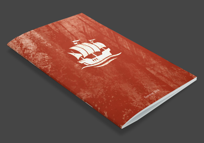
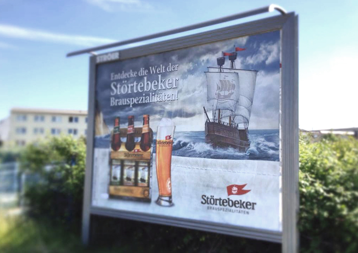
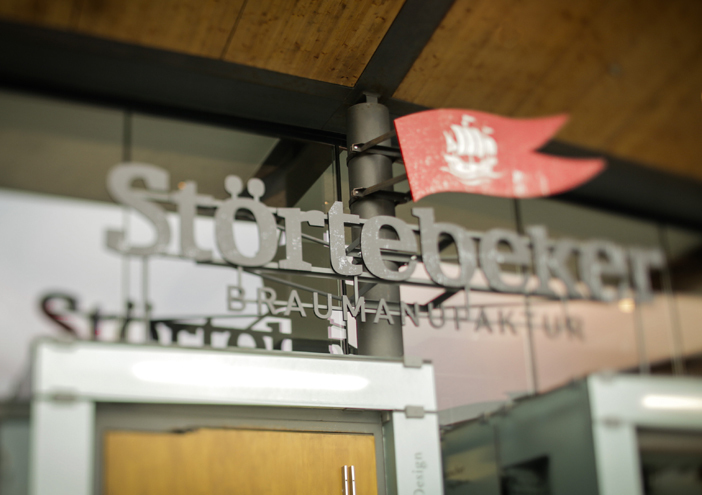
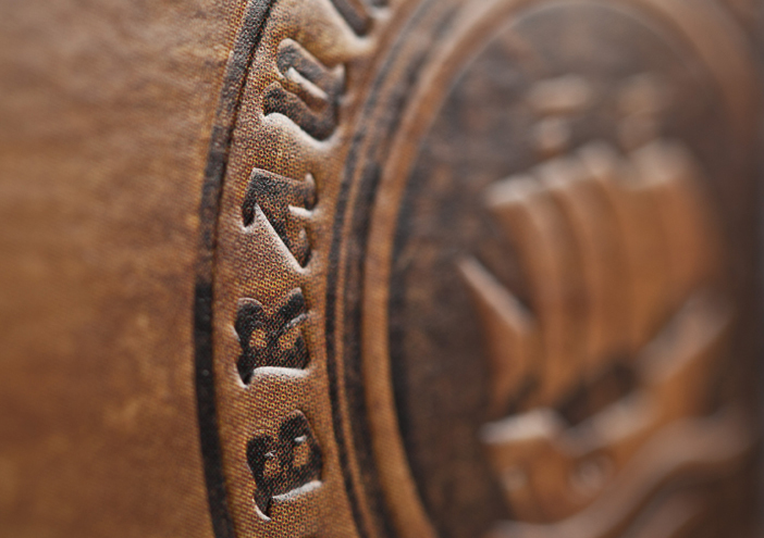
The connection of the past and presence works as the foundation for the relaunch of the brand "STÖRTEBECKER Brauspezialitäten" (brew specialities). Wertmarke develops the key- visual, a cog on the rough sea, as a symbol for the myth STÖRTEBECKER. The trade mark - a red banner - will decorate every product and communication tool in trade.

Zurück zur Übersicht
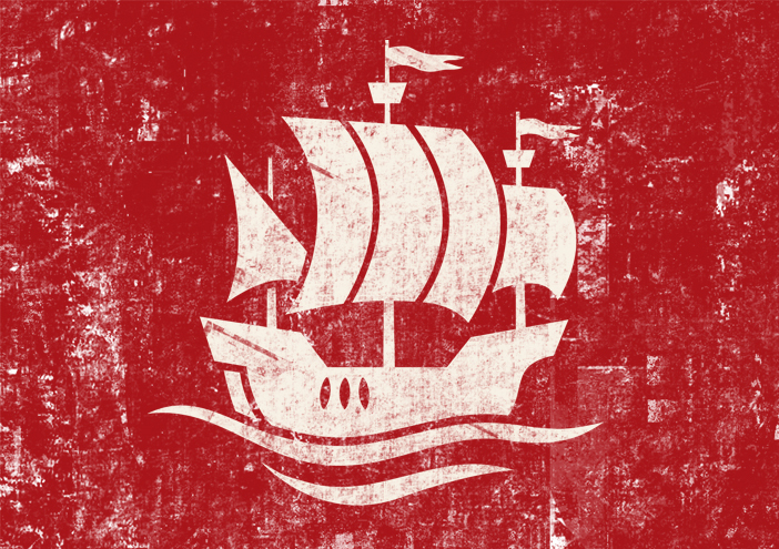
Stoertebeker fahne
Stoertebeker icons
Stoertebeker broschuere
Stoertebeker logo
Stoertebeker werbung
Stoertebeker signage
Stoertebeker herkunftssiegel
Stoertebeker revier

Corporate Design

further interesting projects

CARLS an der Elbphilharmonie

CARLS an der Elbphilharmonie Product Design

For the opening of CARLS at the Elbphilharmonie, a subsidiary company of the hotel Luis C. Jacob, wertmarke develops a tin for their high-quality spices. Besides a viewing window and the brand name...

Eisbock

Eisbock Packaging

wertmarke kreiert die schönste Bierflasche der Welt! Zu diesem Schluss kommt die Jury des Worldstar Packaging Award 2018...

Bio-Biergenuss aus dem hohen Norden

Bio-Biergenuss aus dem hohen Norden Packaging

Ein erfrischendes Prost mit der grünen Flasche – dem neuen Stralsunder BIO-PILS. Mit diesem Bier lässt sich nicht nur der Moment mit Freund*innen einfangen, sondern auch die Kraft der Natur, denn die ist in den Zutaten enthalten.

stoertebeker-eph.com

stoertebeker-eph.com UI/UX-Design

get in touch with wertmarke

Contact

wertmarke hamburg GmbH
Alte Druckerei
Bahrenfelderstr. 73b

D-22765 Hamburg

Inquiries