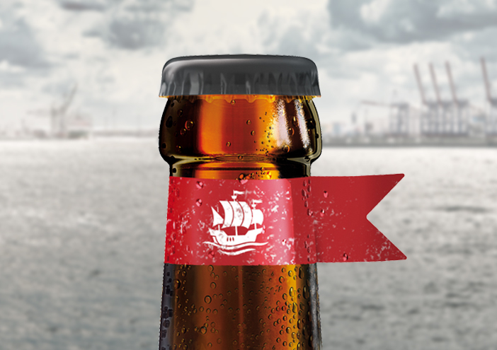
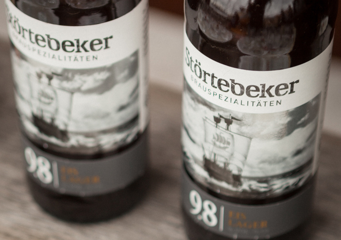
Packaging

Eisbock - Die schönste Bierflasche der Welt!

wertmarke kreiert die schönste Bierflasche der Welt! Zu diesem Schluss kommt die Jury des Worldstar Packaging Award 2018. Das kühle Design, das Rückschlüsse auf den Inhalt – das Eisbock Bier von Störtebeker - zulässt, überzeugte in jeder Hinsicht.

Zurück zur Übersicht

Designkonzept

Kühl und zurückhaltend präsentiert sich das Design der Eisbock-Flasche. Das Etikett ist ganz in Schwarz-weiß gehalten und fasziniert durch seinen metallischen Schimmer. Die Gestaltung gibt einen Vorgeschmack auf den kühlen Genuss und erinnert gleichzeitig an den Entstehungsprozess des Starkbiers. Die kleine rote Fahne um den Flaschenhals verweist auf die Marke Störtebeker.

1404x990
Stoertebeker eisbock fahne1
Stoertebeker eisbock etikett1
Stoertebeker eisbock icon
Stoertebeker eisbock

Packaging

further interesting projects

Qowaz Biermix

Qowaz Biermix Packaging

The look of the 50s functions as the basis for the brand identity of the mixed beer beverage Qowaz (wheat, coke and lemongrass). The packaging concept combines labels...

KAROO Wasser

KAROO Wasser Packaging

Wertmarke is instructed to develop a new packaging concept for the South African mineral water KAROO. The name reflects the product and thus it is mandatory to communicate the purity and quality of the well...

kunstschule-wandsbek.de

kunstschule-wandsbek.de UI/UX-Design

Communication on eye-level is the overall motto! Direct quotes and snapshots of the everyday life at the KW shape the website. Together with a new logo developed...

störtebeker.com

störtebeker.com UI/UX-Design

The web appearance of the Störtebeker Braumanufaktur is innovative as well:As one of the first breweries Störtebeker offers its costumers an online- shop in which they can compose individual beer rates containing different specialties...

get in touch with wertmarke

Contact

wertmarke hamburg GmbH
Alte Druckerei
Bahrenfelderstr. 73b

D-22765 Hamburg

Inquiries