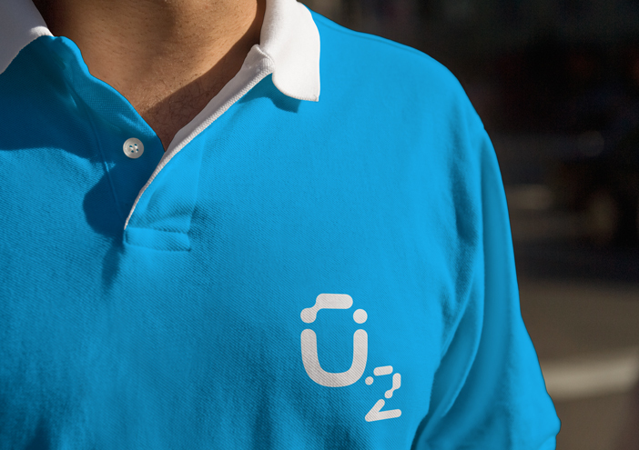
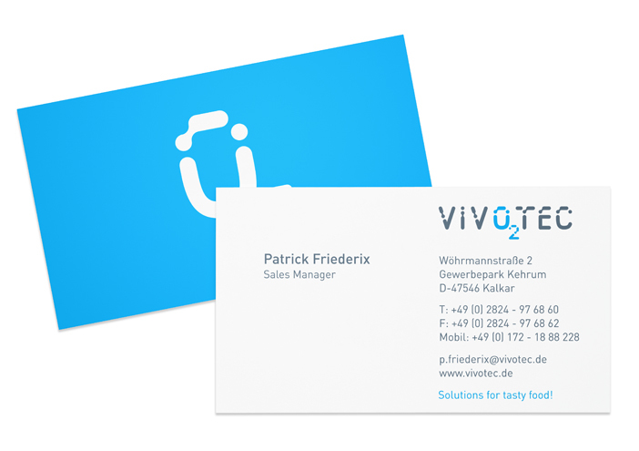
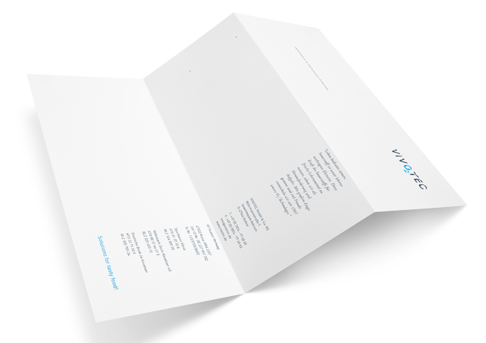
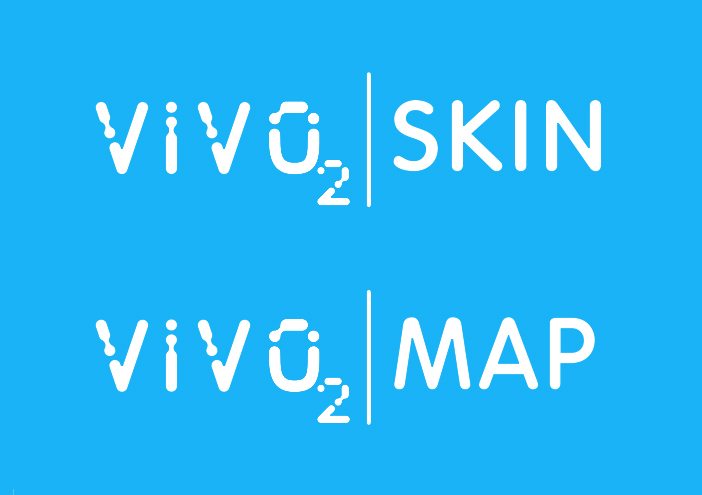
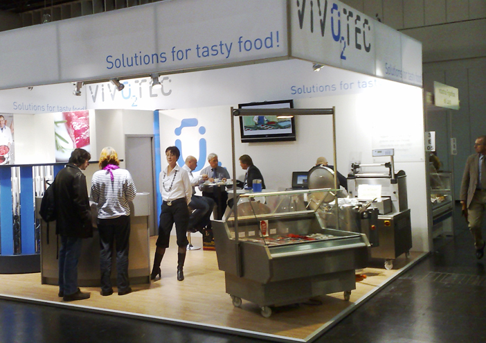
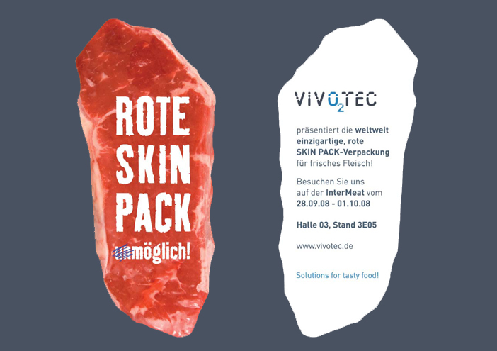
Corporate Design

VIVOTEC – Solutions for tasty food!

Client and VIVOTEC- owner Hubert Verhak is the inventor and worldwide patentee of O2- technology in the food sector. Wertmarke performs the relaunch of the brand VIVOTEC, whose name symbolizes the union of oxygen/life = VIVO and technology = TEC.

Zurück zur Übersicht
Vivotec logo
Vivotec t shirt
Vivotec visitenkarte
Vivotec briefbogen
Vivotec submarken
Vivotec messestand
Vivotec philosophie
Vivotec messeinladung
Vivotec film

design concept

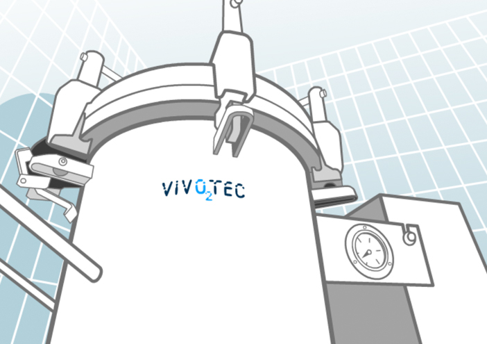
The specially developed logoscript, as well as the chosen coporate colours, symbolize the union of oxygen/ life= VIVO (blue) and technology= TEC (grey). Due to the integration of the chemical symbol for oxygen "O2" every observer knows immediately what VIVOTEC- O2- technology is based on.

1404x990

Corporate Design

further interesting projects

stoertebeker-eph.com

stoertebeker-eph.com UI/UX-Design

Störtebeker Single Malt Whisky

Störtebeker Single Malt Whisky Product Design

For Störtebeker‘s Single Malt Whisky wertmarke designs a packaging in vintage style - from the covering box to lasered wooden closure. Together with a stamp "Matured in oak barrels" the whole design depicts...

stoertebeker-brauquartier.com

stoertebeker-brauquartier.com UI/UX-Design

cu-camper.com

cu-camper.com UI/UX-Design

The new online booking portal cu-camper.com reveals impressive pictures of landscapes and camping framed by a suitable colour concept that depicts the outdoor theme. It offers a user...

get in touch with wertmarke

Contact

wertmarke hamburg GmbH
Alte Druckerei
Bahrenfelderstr. 73b

D-22765 Hamburg

Inquiries