In einem 18-monatigen Markenbildungsprozess entwickelt wertmarke die neue Dachmarke „Binzer Bucht“ mit den Submarken „Binz“ und „Prora“. Entstanden ist ein Corporate Design für den...
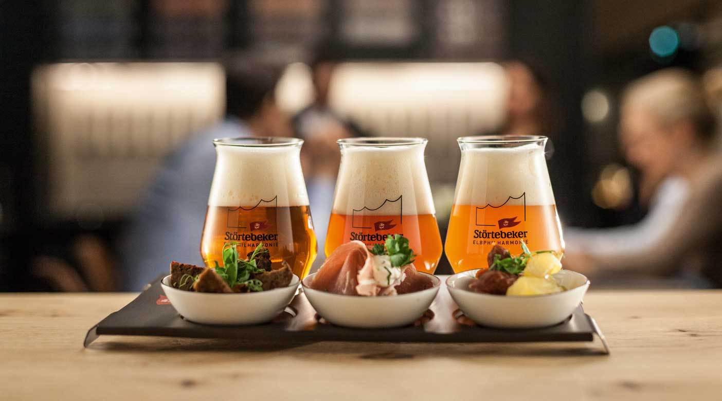
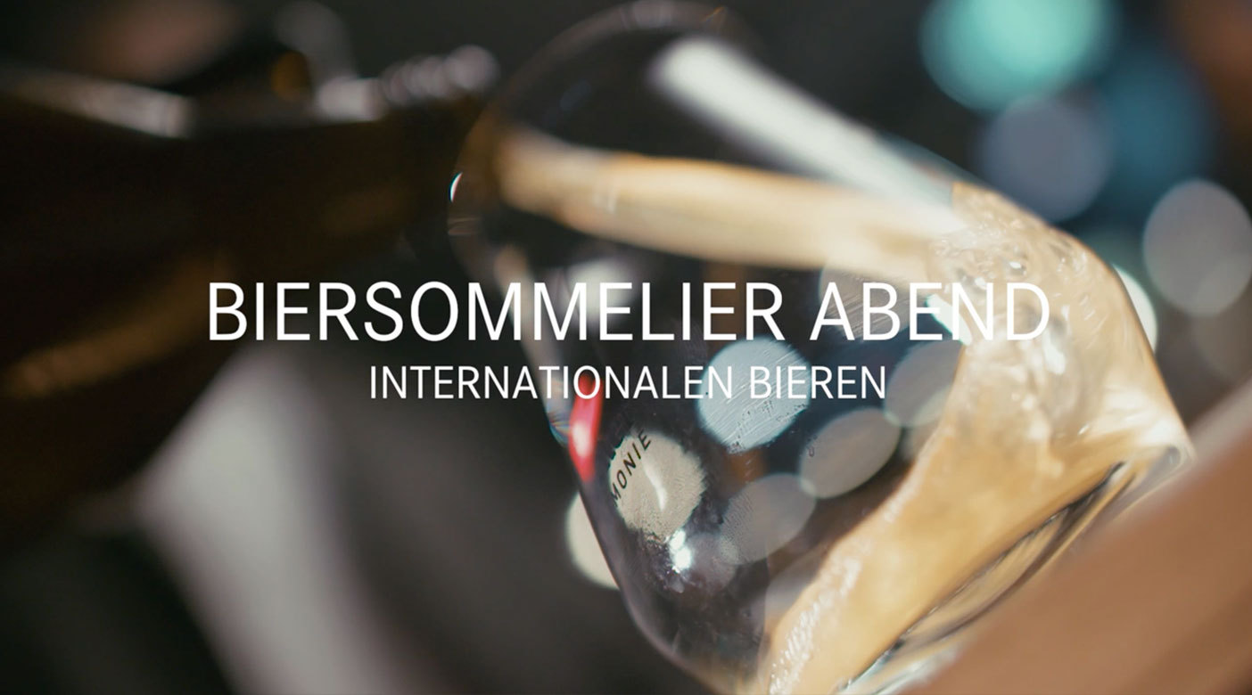
Pünktlich zum Sommerbeginn freut sich die Störtebeker Braumanufaktur, das "Sommer-Wit" vorzustellen – eine von vier neuen Biersorten für jede Jahreszeit.