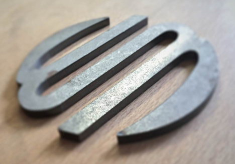
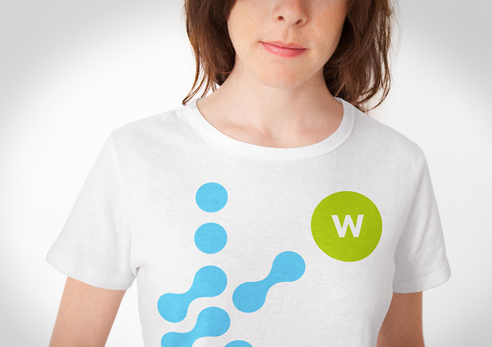
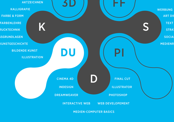
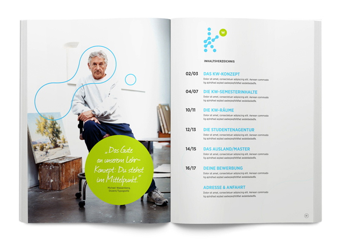
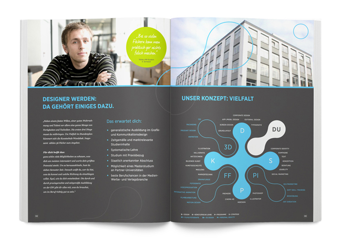
Corporate Design

School of Arts Wandsbek

Communication on eye- level is the motto of the School of Arts in Wandsbek.„ Direct quotes and snapshots of their everyday life shape their broshures, website, imagefilm and exhibition stand. In the centre of their new appearance occurs the logo, with which wertmarke visually clarifies the values of their school: the collaboration of individuality and group identity.

Zurück zur Übersicht
Kw t shirt
Kw infografik
Kw broschuere
Kunstschule wandsbek bildmarke
Kw broschuere2
Kw bildsprache

design concept

To emphasize that the cooperation of individual parts and therefore individual humans always create new unique shapes and pictures, single shapes and components from the logo were used to design wall graphs, details in the brochures or to arouse disturbing systematics. These can either be enclosed areas or an outline- application within the corporate colours.

1404x990

Corporate Design

further interesting projects

Canada meets Hamburg

Canada meets Hamburg Packaging

Für das Packaging-Design kombinierte wertmarke mit KI-generiertem Key-Visual
die Hamburger Stadtsilhouette – von der Elbphilharmonie bis zur Köhlbrandbrücke –
mit der kanadischen Landschaft Okanagans.

Binzer Bucht

Binzer Bucht Corporate Design

In einem 18-monatigen Markenbildungsprozess entwickelt wertmarke die neue Dachmarke „Binzer Bucht“ mit den Submarken „Binz“ und „Prora“. Entstanden ist ein Corporate Design für den...

EAT BEER Biotech - Corporate Design für zirkuläre Innovation

EAT BEER Biotech - Corporate Design für zirkuläre Innovation Corporate Design

Aus einem Reststoff wird ein Rohstoff. Aus einer Technologie wird eine Haltung.
Für das Start-up EAT BEER Biotech entwickelte wertmarke ein präzise abgestimmtes Corporate Design, das nicht nur den technologischen Anspruch des Unternehmens visualisiert, sondern auch seine Vision von zirkulärer Wertschöpfung konsequent transportiert.

Fass No. 1 – Design für ein nordisches Original

Fass No. 1 – Design für ein nordisches Original Packaging

Wenn ein Whisky Premiere feiert, der mehr ist als nur ein Getränk, braucht es ein Design, das diesem Anspruch gerecht wird. Für die Störtebeker Brennerei hat wertmarke mit „Fass No. 1“ ein markantes Produktdesign entwickelt – klar, reduziert und voller Charakter.

get in touch with wertmarke

Contact

wertmarke hamburg GmbH
Alte Druckerei
Bahrenfelderstr. 73b

D-22765 Hamburg

Inquiries